

Survive the nightmare of the future to save what remains of the past
The beloved classic fully remade for next-gen hardware
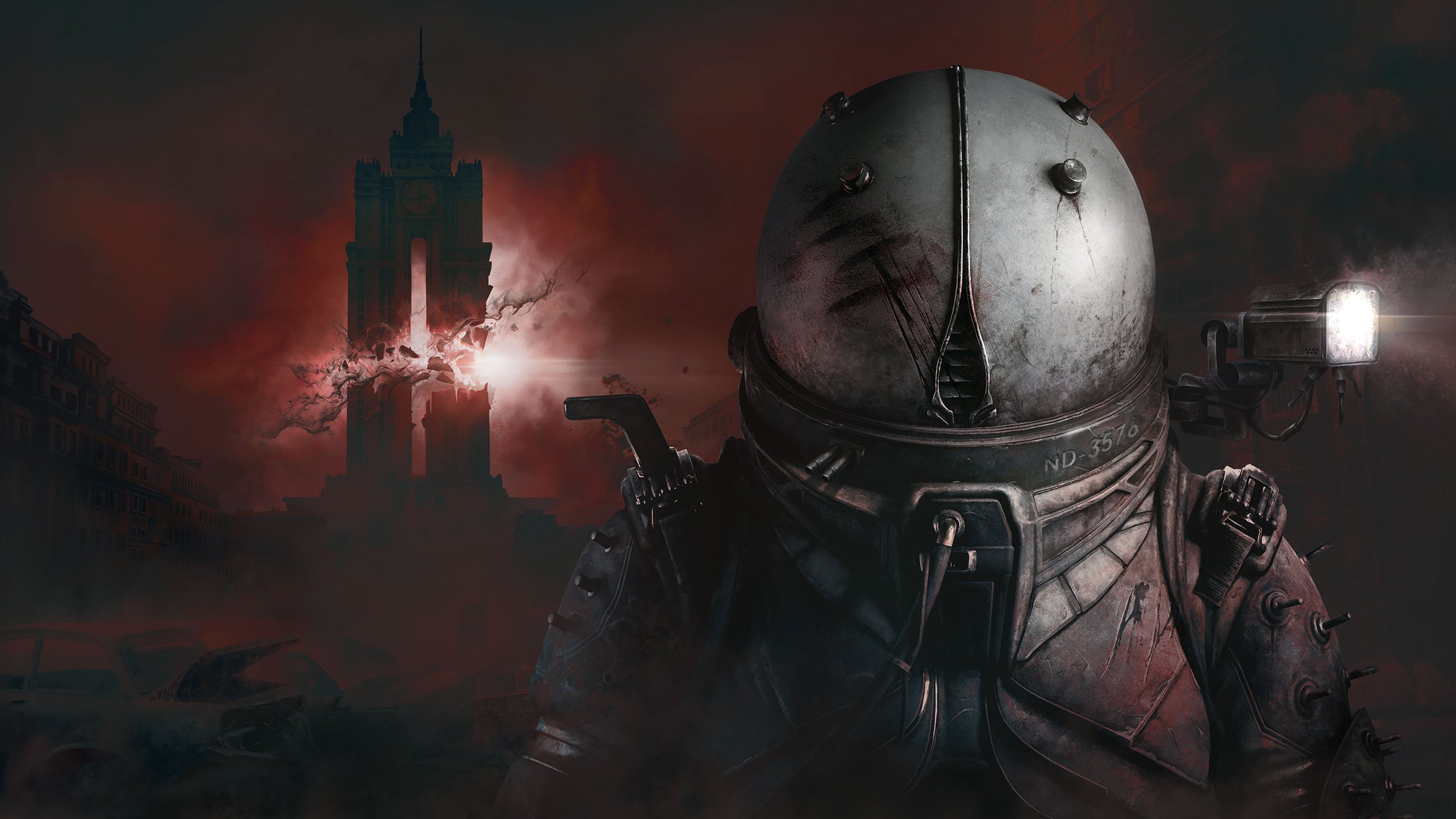
The series' crowning work
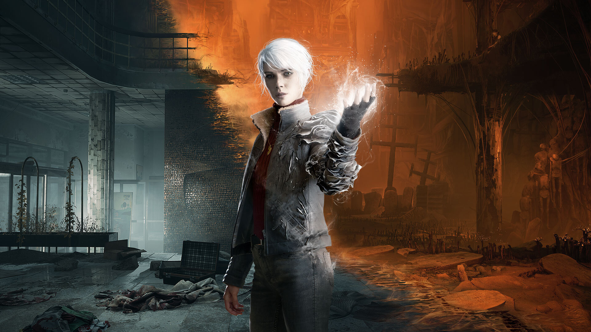
You've only seen half so far
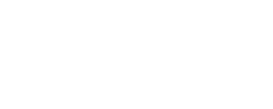
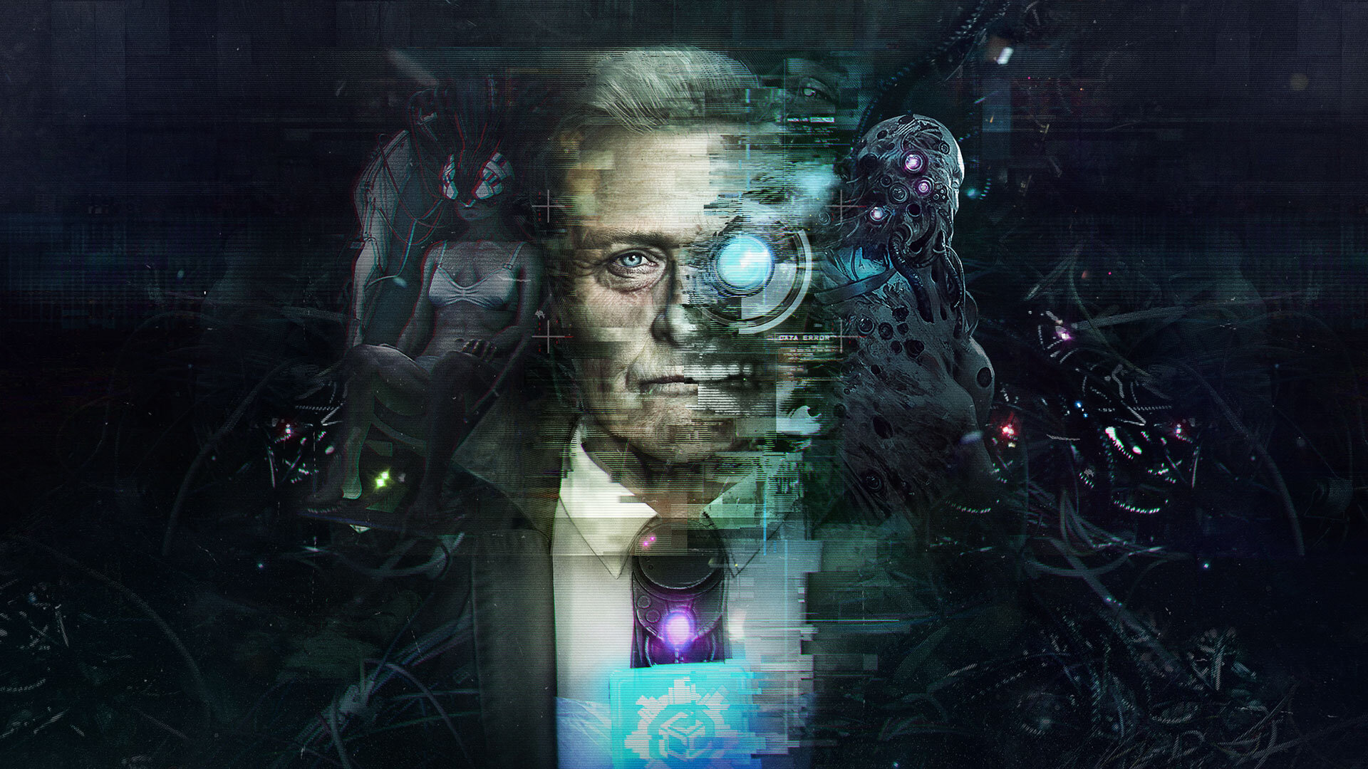
The award-winning dystopian thriller goes next-gen
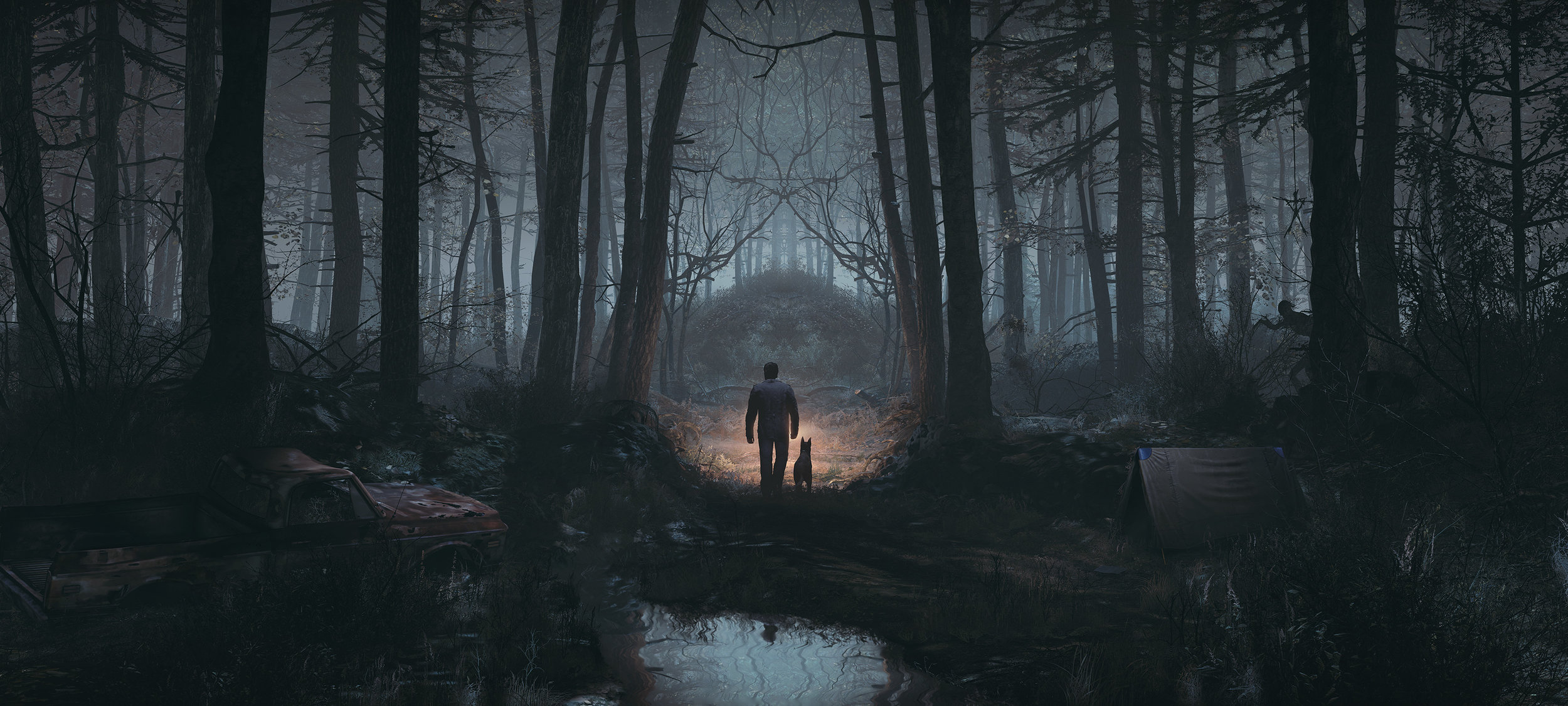
Evil hides in the woods
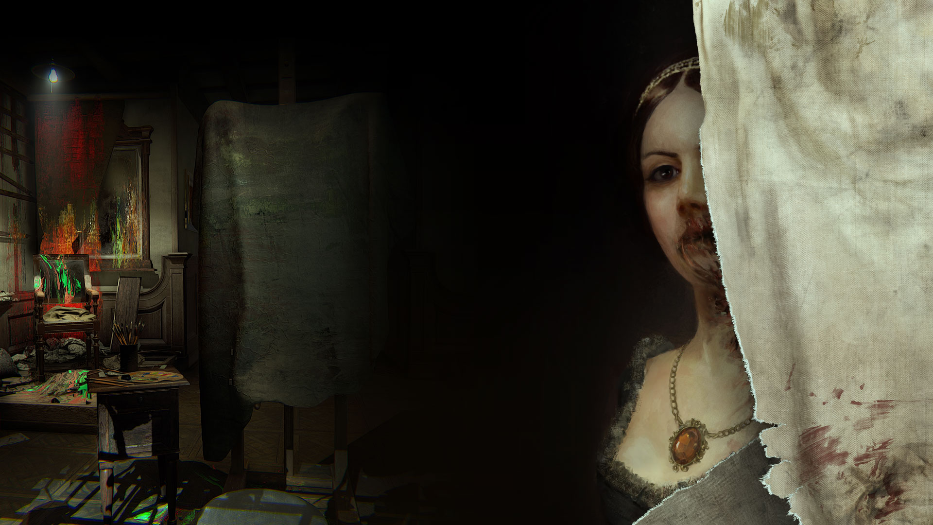
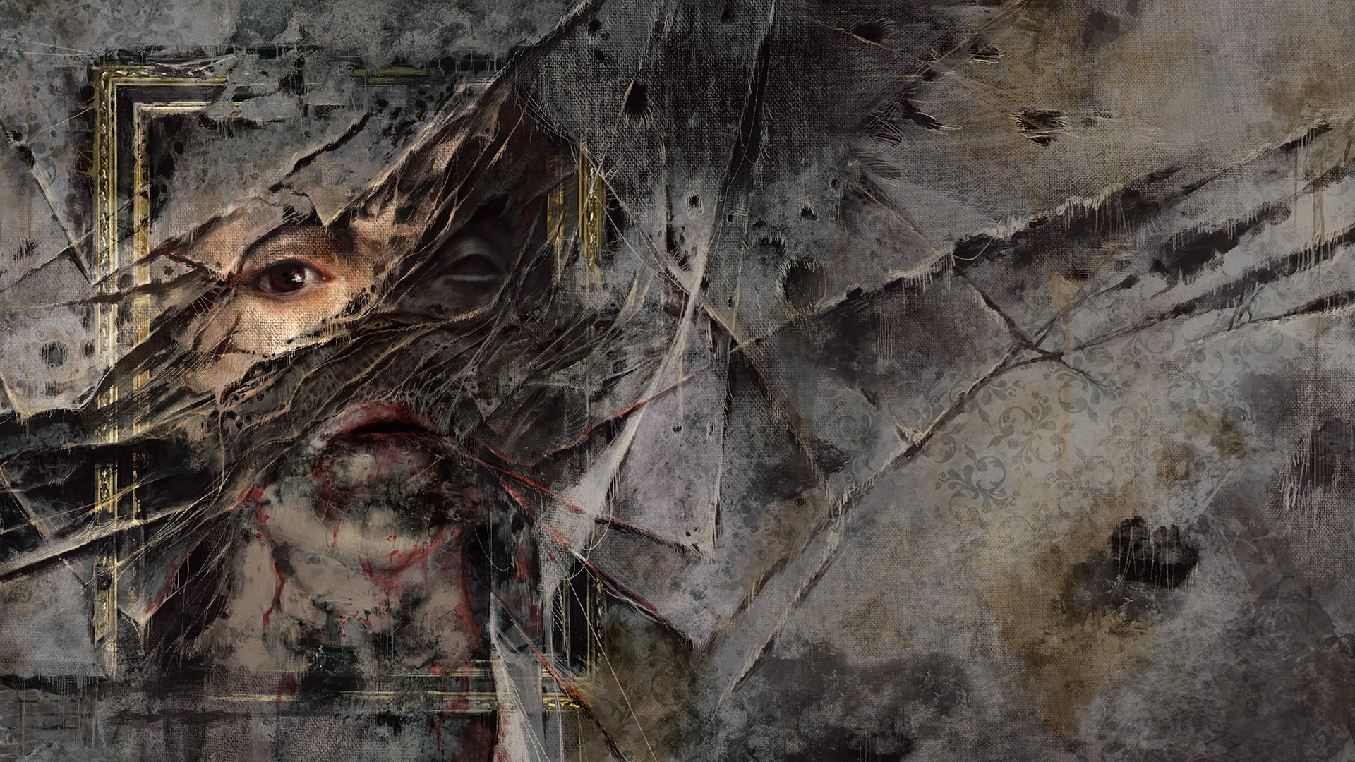
An act of creation always begins with an act of destruction
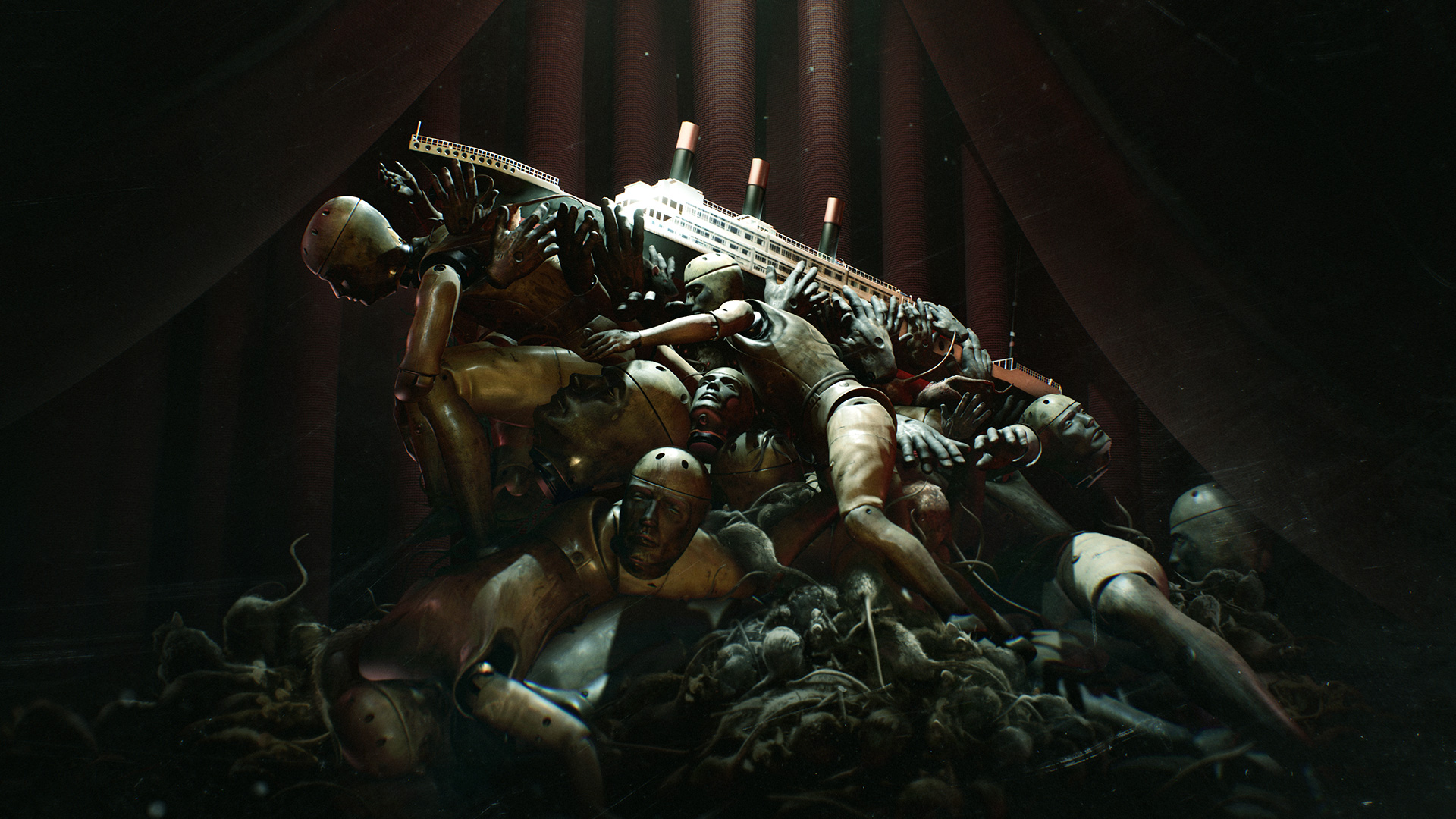
The masterpiece of fear
The most immersive horror game on Nintendo Switch™
LEARN MORE »
An expansion for the award-winning Layers of Fear.
LEARN MORE »
Witness the Masterpiece of Fear in VR.
LEARN MORE »